


.avif)


TL;DR – ClickUp’s onboarding is lightning‑fast and visually polished, but the multi‑step wizard and dense UI can trigger fatigue before new users hit their first “aha!” moment.
Steal‑this‑idea: The way ClickUp turns the integrations you choose in the wizard into tappable tiles on the homepage is chef’s kiss—an elegant hand‑off from signup to first value.
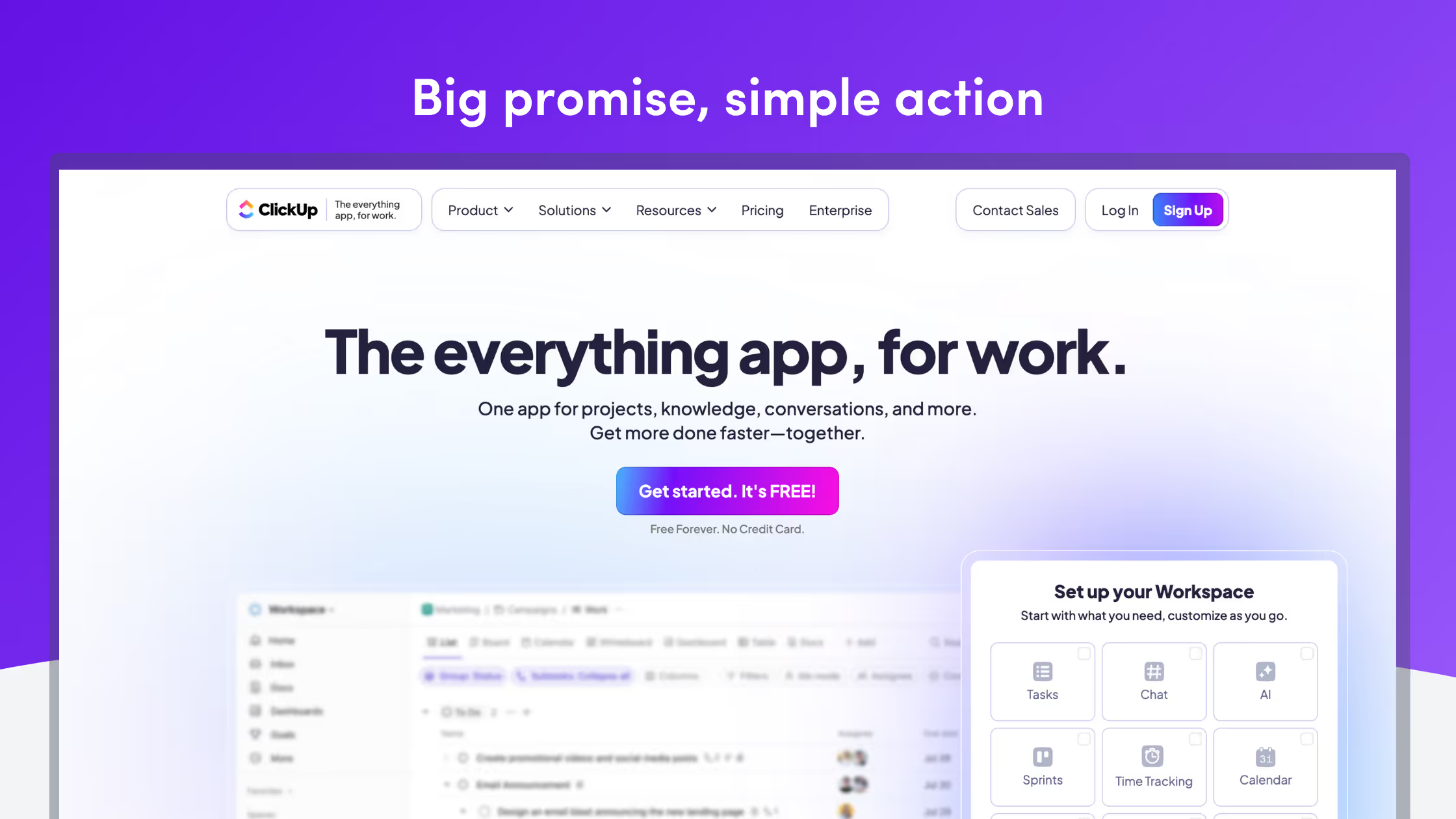
First Impressions – A Promise for “Everything”
ClickUp’s positioning is intentionally broad—one app for every team and any workflow. The upside: huge top‑of‑funnel. The downside: new users still need a sharply defined first success path. Every onboarding choice should narrow the aperture toward one clear use case.
Where ClickUp Shines
Below is a rapid-fire look at the micro-moments that already delight inside ClickUp’s onboarding.
| Moment | Why it works | Screenshot |
|---|---|---|
| Speed everywhere | Views render in ≈1 s, proving the performance claim instantly. |

|
| Subtle motion | A playful loading indicator shows off ClickUp's speed and brand identity. |

|
| Integration tiles | Import cards re-appear as one-click tiles—value sign-posted before you even click. |

|
| Blurred-backdrop wizard | Keeps the workspace visible so progress never feels disorienting. |

|
Grab our personalized onboarding templates.
Where Friction Creeps In
Even beautifully crafted flows hide speed-bumps. The table that follows pinpoints the spots where new users are most likely to stumble (and why it matters).
| Friction | Impact on activation | Screenshot |
|---|---|---|
| Seven-step wizard | 72 % of users abandon flows with high step counts.1 |

|
| Choice-overload grid | Twelve pill buttons (*Marketing, IT, Ops…*) demand big decisions immediately. |

|
| Phone-number request | Feels like a hurdle before users see value. |
|
| One-shot video demo | Intro tour flashes once and can’t be replayed—lost education moment. |

|
| Blank first list | No starter tasks means instant analysis paralysis. |

|
Stat call‑out: A 25 % bump in activation can translate into a 34 % increase in MRR over 12 months² – every friction point matters.
Six Quick Wins the ClickUp Team (or You!) Could Ship Tomorrow
If you only have one sprint to improve onboarding metrics, start with the six tweaks below. Each takes <1 day to implement and compounds over time.
Key Takeaways
- Broad promise, narrow path – ClickUp sells “everything,” but each onboarding choice should ruthlessly narrow to a single first success.
- Integrations as tiles – Turning wizard selections into homepage shortcuts is a brilliant pattern you should steal (see our Integration tiles template).
- Speed & polish delight, but cognitive overload drags first‑session energy.
Turn These Insights into Live UX
- Grab the free Modal Onboarding Flow template featured in this post — one click clones it straight into your Candu workspace.
→ https://www.candu.ai/templates/modal-onboarding-flow - Start a 14‑day free trial of Candu (no credit card) and ship your first in‑app experience before lunch.
→ https://app.candu.ai/signup
Sources
1. UserGuiding Onboarding Stats 2025 – 72 % abandonment on long wizards.
2. Fairmarkit / HubSpot – Activation → MRR correlation (2024 study).
3. ClickUp Review 2024 – RapidViews DB™ performance gains.


.avif)
